It takes a lot of courage for a company to launch yet another to do list on a world that seems to want chaos but that’s exactly what Microsoft has done. After buying Wunderlist in 2015, the company has swiped many of its features, built them into its own app and is now getting ready to boot Wunderlist into digital history.
The result is both pleasing and surprisingly frustrating. The program itself is as simple as you might expect. While Google’s Keep allows users to see a bunch of lists laid out like Post It notes, Microsoft is keeping the traditional list and checkbox format. An icon lets you create a new list and add new tasks. Inside the tasks, you can add the kinds of notes, reminders and deadlines that are familiar to anyone who has ever used a calendar app. The check-off procedure (made in a circle instead of a square checkbox) produces both a crossout and a satisfying ping.
So far, so standard. Microsoft does excel in a few areas though. Each new list can be themed and colored. It would be nice to be able to use your own images for those themes but the small selection provided in the app is attractive and gives each list a unique appearance. The app syncs neatly across formats, letting you pick up your list when you move between your computer and your mobile device. You can also import your lists from Todoist and less surprisingly, from Wunderlist.
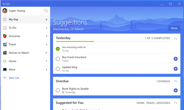
More interesting is To-Do’s intelligent Suggestions. The app lets you place tasks in a prepared My Day list but you can also let the app create that list for you. Based on a “smart algorithm,” the app will check your tasks and recommend the most important for the day. Remember that you need to buy an anniversary present next week, and you can make a note and rely on To-Do give you a reminder on the right day.
All of that is fine. It works well, and it looks attractive. If there were no other to do list programs available in app stores or from software companies then it would be more than sufficient.
But Microsoft To-Do is supposed to replace Wunderlist, which had additional features, including the ability to organize lists into folders and build sub-lists. For people using productivity systems like David Allen’s GTD, that makes the app unusable. Microsoft has said that it intends to add more features but until it does, To-Do’s biggest sales feature will be its recommended daily tasks — and that won’t be enough for GTD fans.
Microsoft To-Do is available as an app for iPhone and Android, and for Windows 10 but it’s not yet available for Mac or for older versions of Windows.
Conclusion
Microsoft To-Do is an effective task organizer with a pretty design and a smart, suggested daily list. If you need 43 folders to organize your life though, you’ll pine for Wunderlist.
| Usability: 8 /10 | Speed: 9 /10 | Features: 7 /10 | Support: 3 /10 | Pricing: 10 /10 |


Usability
7
Speed
8.5
Features
5
Support
3
Pricing
10
To do is seriously driving me crazy as someone who needs to create shared to do lists with people both within my company and volunteers outside of it.
If I used my work email address I can’t share lists with those outside of our organisation. I could create a personal one, but then I can’t share it with anyone using a work or school account. Ridiculous.
With thousands of complaints för lacking the possiblity to print the lists it’s a tool not worth wasting time with.